

The rise of restaurant reservation apps has transformed the way people book tables. However, current solutions often fall short in accommodating specific seating requests. Whether it's a cozy corner spot for a romantic evening or a central table for a special celebration, users crave more control over their dining experience


PROBLEM STATEMENT
Existing restaurant reservation systems fail to provide users with the flexibility to choose their desired seating arrangement, leading to disappointment and inconvenience.
HYPOTHESIS
By developing a graphical restaurant reservation app that allows users to visually select their preferred seats and tables, we can enhance the overall dining experience and increase user satisfaction.
To better understand the needs and pain points of users, I developed a research plan outlining goals, methodologies, participants, and timeline
.svg)
.svg)
.svg)
.svg)


I conducted 5 remote interviews and 9 online surveys with participants from metropolitan areas who frequently travel for business and leisure.

QUOTE FROM PARTICIPANT #3
" When looking for a restaurant, I trust more the number of reviews than the actual rating. "
To establish a clear direction for the project, I analyzed a combination of user and business goals, as well as technical considerations. This allowed me to consider multiple perspectives and define a comprehensive set of objectives.
.jpg)
Based on research findings, I created a primary persona, Francis, to represent the target user archetype. This persona will guide future design decisions and ensure the solution meets the needs and expectations of the target audience.

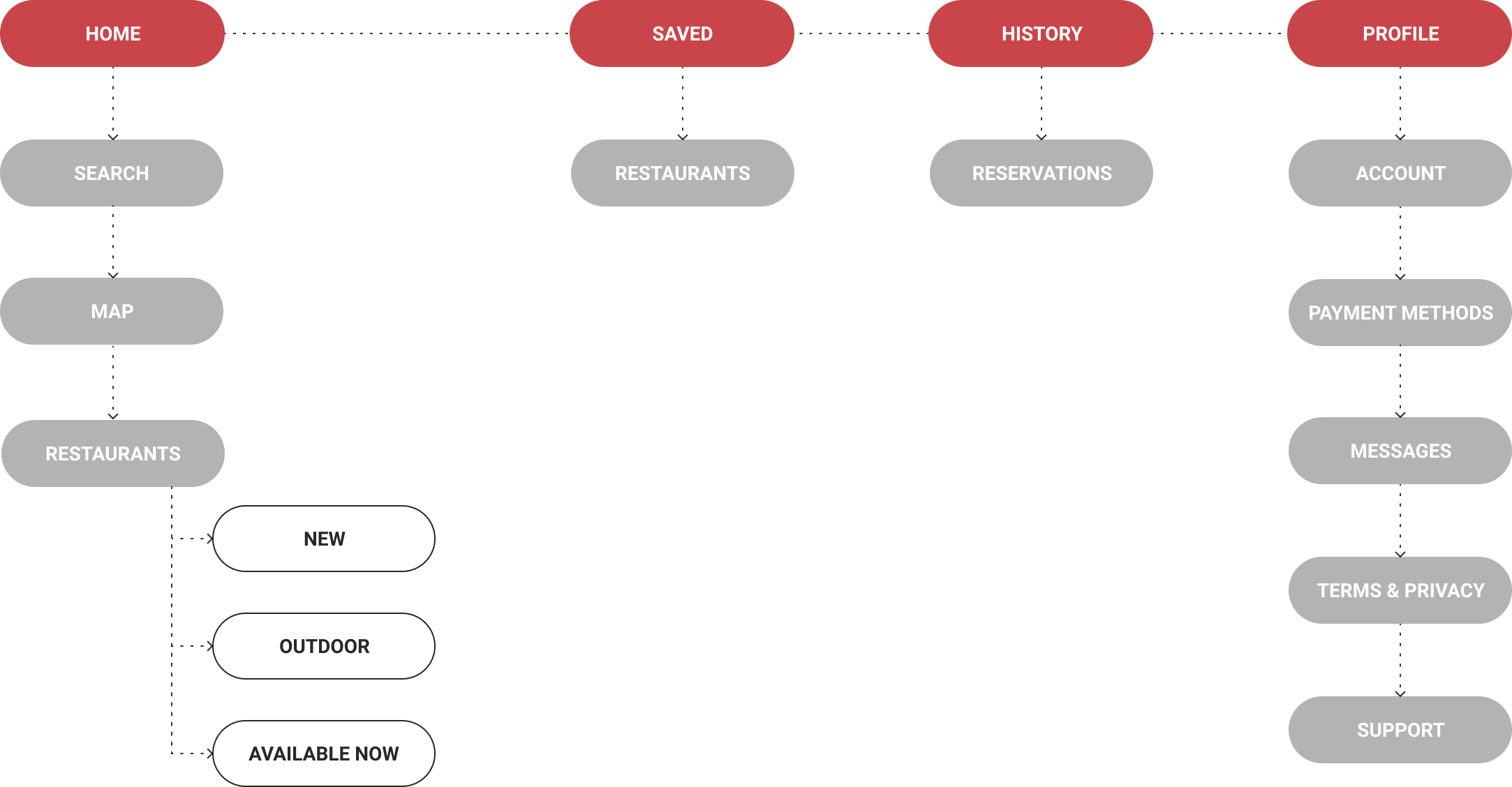
To establish a clear organization of content, I created a sitemap. This foundational step enabled me to visualize the app's structure and ensure a logical flow of information.
To better understand Francis's needs, I defined a task flow for booking a table at a restaurant through the app. This exercise helped me empathize with Francis's thought process and identify potential pain points.
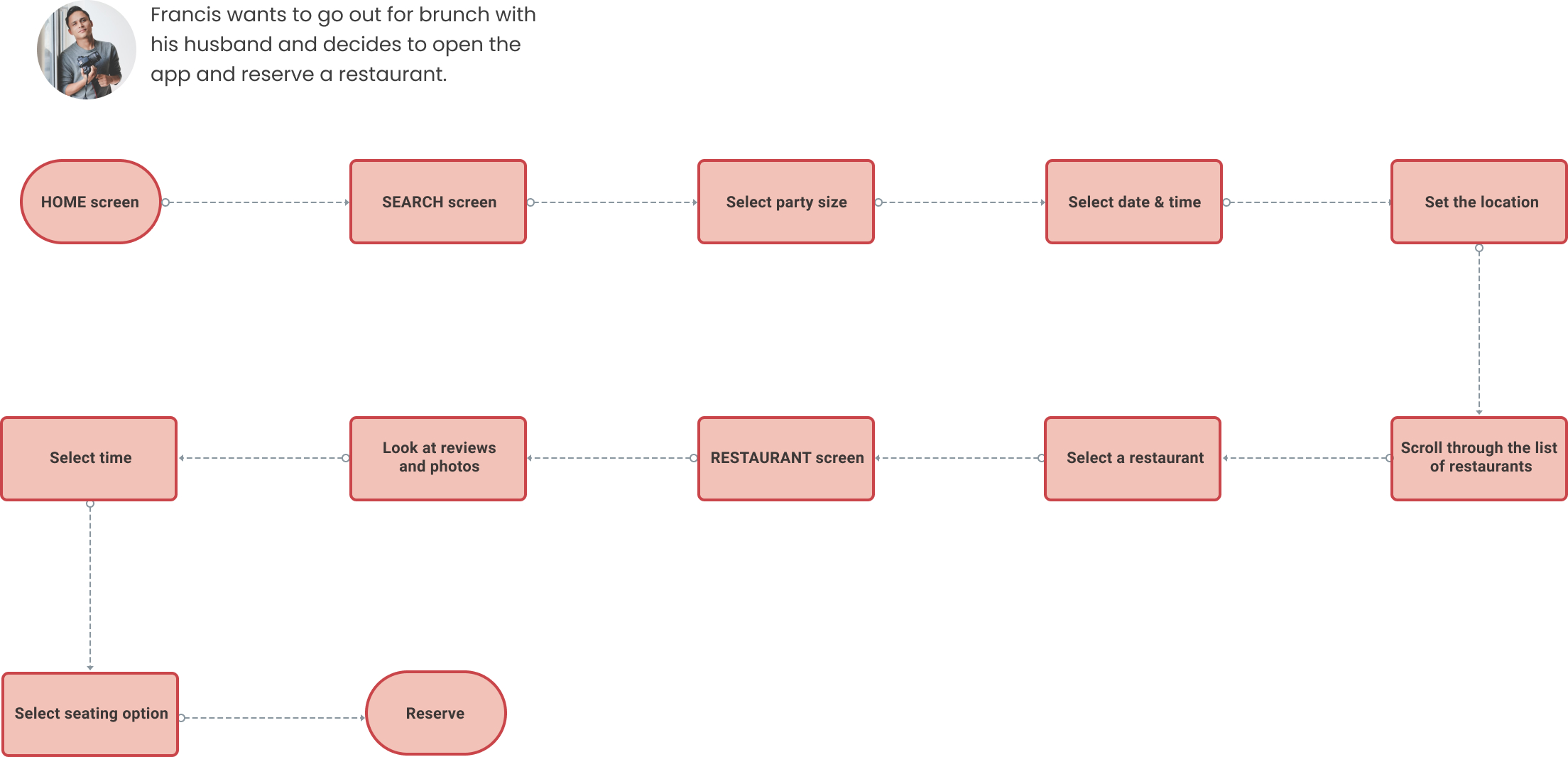
I explored how Francis would interact with the app in various scenarios, including reserving a last-minute table, booking a restaurant for a special occasion, joining a waitlist, and receiving personalized recommendations. By examining these different use cases, I gained insight into Francis's expectations and behaviors, allowing me to design an intuitive and user-friendly experience.
.jpg)
With the key elements defined, I began sketching the app's pages and translating them into wireframes.


These wireframes served as a blueprint for the app's architecture, allowing me to establish a clear hierarchy of content, organize information in a logical and intuitive manner, and validate my design decisions against the research findings.


.png)
To validate the visual direction of the app, I conducted concept testing with 21 participants. I presented three logo and home screen options (magenta, orange, and red) and asked which one resonated most with food.

Based on the overwhelming preference for red, I decided to develop a red color palette for the brand identity.
GROUP SESSION
I facilitated a group session with 10 participants to gather feedback on the low-fidelity design. Key findings included:
Tablee's brand identity is designed to evoke a sense of class, boldness, and friendliness. The chosen red color palette is intended to draw attention, stimulate appetite, and convey warmth and hospitality. By consistently applying this color scheme throughout the app, I aim to create a cohesive and recognizable brand image that resonates with users and sets Tablee apart in the market.


The final responsive design incorporates all the visual explorations of colors, moods, and styles, creating a cohesive and engaging user interface.


To validate the design, I conducted usability testing with a group of 10 participants. I asked them to complete tasks on the Figma prototype, observing how they interacted with and navigated the app.


Based on the usability testing findings, I implemented the following changes to the prototype:
.png)


.png)
TAKEAWAYS
This project revealed several key insights into the future of restaurant apps. The market is experiencing a growing trend towards implementing immersive technologies like AR/VR.
Users crave personalized booking experiences, including table selection and tailored recommendations.
Additionally, the future of restaurants will likely involve menu mapping with machine learning and AR menus, providing a seamless and dynamic experience.
